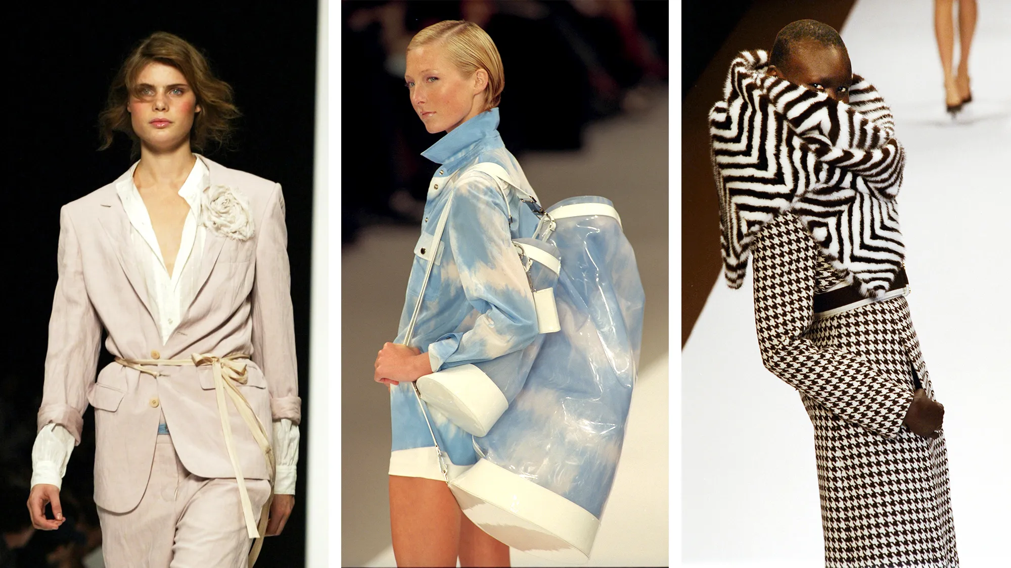
Color theory plays a crucial role in clothing design, influencing not only the aesthetic appeal but also the emotional impact and functionality of garments. By understanding how colors interact and affect perception, fashion designers can create cohesive and visually striking collections that resonate with wearers.

Understanding the Color Wheel
At the heart of color theory is the color wheel, which organizes colors into primary, secondary, and tertiary groups.
- Primary Colors: Red, blue, and yellow are the foundational colors that cannot be created by mixing other colors.
- Secondary Colors: By mixing two primary colors, you get secondary colors—green, orange, and purple.
- Tertiary Colors: These are made by mixing a primary color with a neighboring secondary color, resulting in hues like red-orange or blue-green.
Designers use the color wheel to create harmonious color schemes and make intentional choices about the combinations they use in their collections.
Color Harmony in Clothing Design
Color harmony refers to aesthetically pleasing combinations of colors. These harmonies are essential for creating balanced and attractive clothing designs.
- Monochromatic: This scheme uses different shades, tints, or tones of a single color. Monochromatic outfits create a sleek, cohesive look that can be elegant and modern.
- Analogous: These are colors that are next to each other on the color wheel, such as blue and green. Analogous color schemes are harmonious and pleasing to the eye, offering a subtle variety.
- Complementary: Complementary colors are opposite each other on the color wheel, such as red and green. These combinations create high contrast and can make designs more dynamic and eye-catching.
The Psychological Impact of Color
Colors have the power to evoke emotions and influence perceptions, making them a critical tool in clothing design. Different colors can convey various messages, moods, and feelings.
- Warm Colors: Red, orange, and yellow are warm colors that evoke energy, passion, and warmth. They can be bold and attention-grabbing.
- Cool Colors: Blue, green, and purple are cool colors that evoke calmness, serenity, and professionalism. These colors tend to be more soothing.
- Neutral Colors: Black, white, grey, and beige are often used as base colors in clothing. They provide balance and allow other colors to stand out.
Designers use these psychological effects to create garments that not only look good but also evoke a desired emotional response from the wearer.
Cultural Significance of Color in Fashion
Color meanings can vary significantly across cultures, which is why it’s important for designers to be aware of the cultural context in which their clothes will be worn.
- White: In many Western cultures, white is associated with purity and weddings. However, in some Eastern cultures, white is a symbol of mourning.
- Red: Red often symbolizes love and passion, but in China, it is considered a lucky color, symbolizing prosperity and happiness.
- Black: While black is often associated with sophistication or mourning in Western cultures, it can have different meanings in other regions, such as power or mystery.
Designers often incorporate cultural meanings of colors into their collections to appeal to specific markets or occasions.
Using Color to Define Silhouette and Structure
Color can be used strategically to enhance or alter the perceived silhouette of a garment. Lighter colors tend to enlarge the appearance of an area, while darker shades make areas appear smaller.
- Highlighting or Minimizing Areas: Designers use color blocking or shading to highlight certain parts of the body or minimize others, creating a flattering silhouette.
- Creating Visual Interest: Bold, contrasting colors can add visual interest and draw attention to key design elements. Subtle color gradations, on the other hand, create soft transitions that make the overall design feel more cohesive.
Seasonal Color Trends
Fashion trends often follow seasonal color shifts. These trends are typically based on consumer preferences, cultural events, and environmental factors.
- Spring/Summer: Bright, pastel, or light colors dominate these seasons, symbolizing growth, warmth, and renewal.
- Fall/Winter: Rich, deep colors like burgundy, mustard, and forest green become popular, reflecting the natural environment and cooler temperatures.
Designers use these seasonal shifts to keep their collections relevant and appealing to consumers’ changing tastes throughout the year.
Conclusion
Color theory is essential in clothing design as it influences aesthetics, evokes emotions, and shapes cultural perceptions. By understanding the principles of color harmony, psychology, and cultural significance, designers can create garments that are not only visually stunning but also meaningful and impactful.


