Color patterns in tapestries play a crucial role in shaping the visual appeal and emotional impact of a space. From vibrant hues to subtle shades, the use of color in tapestry design can enhance interiors, create focal points, and evoke specific moods. Understanding different color patterns helps in selecting tapestries that best suit your decor and personal style.
The Impact of Color on Mood
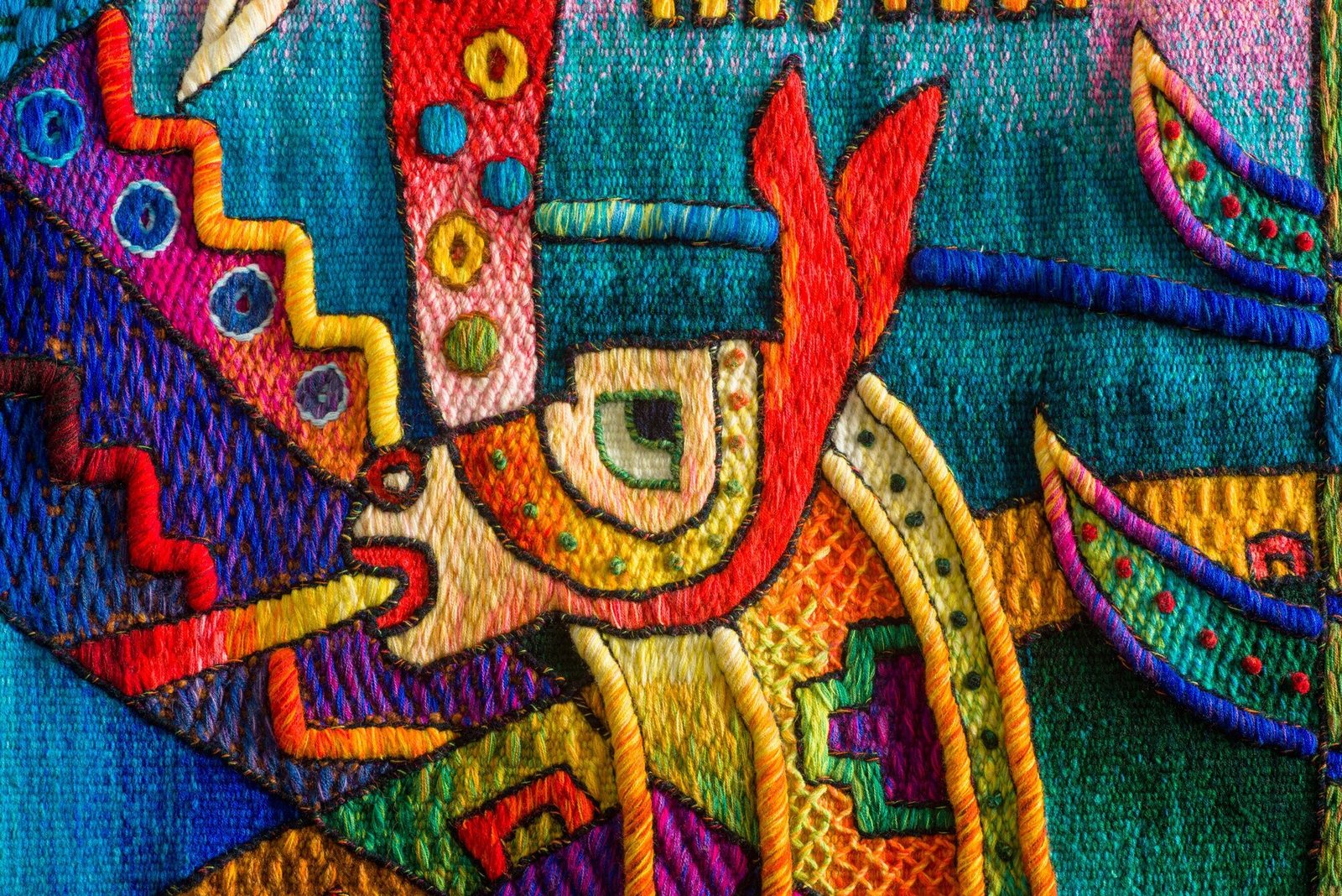
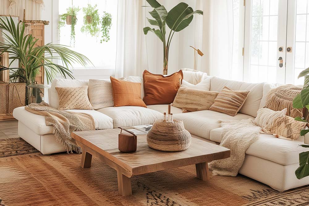
Color has a profound effect on mood and atmosphere. In tapestry design, color patterns can influence how a space feels and how it is perceived. For instance, warm colors like reds, oranges, and yellows create a cozy and inviting atmosphere, while cool colors like blues, greens, and purples offer a calming and serene environment. Choosing the right color palette for your tapestry can set the tone for the entire room.
Monochromatic Schemes
Monochromatic color schemes involve using variations of a single color. This approach creates a harmonious and cohesive look. Tapestries with monochromatic patterns can add depth and interest without overwhelming a space. This design is particularly effective in modern interiors where a minimalist or sophisticated aesthetic is desired.
Complementary Colors
Complementary color schemes use colors that are opposite each other on the color wheel, such as blue and orange or red and green. This approach creates vibrant contrasts and dynamic visual interest. Tapestries with complementary colors can energize a room and draw attention to specific areas. This color pattern is ideal for spaces where a bold statement is desired.
Analogous Colors
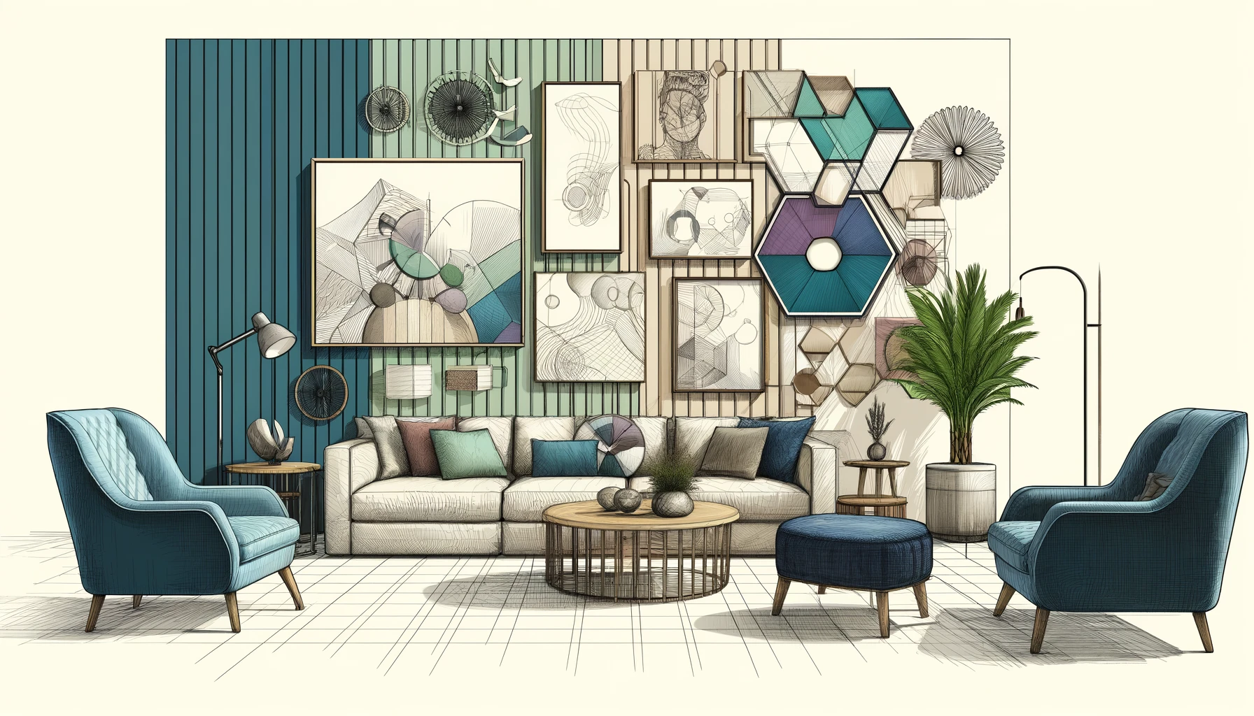
Analogous color schemes involve using colors that are next to each other on the color wheel, such as blue, blue-green, and green. This pattern creates a serene and cohesive look by blending colors that naturally complement each other. Tapestries with analogous color schemes can enhance a room’s color palette while maintaining a harmonious and balanced appearance.
Geometric Patterns and Color Blocking
Geometric patterns and color blocking involve using distinct shapes and bold color blocks to create striking visual effects. Tapestries with geometric designs often feature clean lines and sharp contrasts, adding a contemporary touch to interiors. Color blocking, which involves large areas of contrasting colors, can make a tapestry stand out and serve as a focal point.

Floral and Nature-Inspired Patterns
Floral and nature-inspired patterns often use a range of colors to depict natural scenes or botanical elements. These patterns can vary from subtle and muted to vibrant and colorful. Tapestries with floral or nature-inspired designs can add a touch of organic beauty and bring a sense of the outdoors inside. This style is versatile and can complement both traditional and modern decor.
Abstract and Artistic Designs
Abstract and artistic designs offer freedom in color usage and pattern formation. These tapestries often feature non-representational patterns and a mix of colors that evoke emotion or create visual intrigue. Abstract tapestries can serve as conversation pieces and bring a unique artistic element to any space. They are well-suited for modern and eclectic interiors.
Seasonal and Thematic Colors
Seasonal and thematic color patterns reflect different times of the year or specific themes. For example, autumn-themed tapestries may use warm, earthy tones, while summer designs might incorporate bright, vibrant hues. Selecting a tapestry with seasonal or thematic colors can enhance the ambiance of a room and align with your overall decor theme.
Conclusion
Exploring color patterns in tapestries reveals their potential to transform a space. From monochromatic and complementary schemes to abstract and nature-inspired designs, the use of color in tapestry art can significantly impact the mood and aesthetics of a room. By understanding these patterns, you can choose tapestries that enhance your decor and reflect your personal style.


